
Why a Mobile-Friendly Website is Now Non-Negotiable
Introduction: The Shift to a Mobile-First World
In today’s digital-first world, a website is often the first impression people have of your brand, institution, or service. But here’s the truth: if your website isn’t mobile-friendly, you’re already behind.
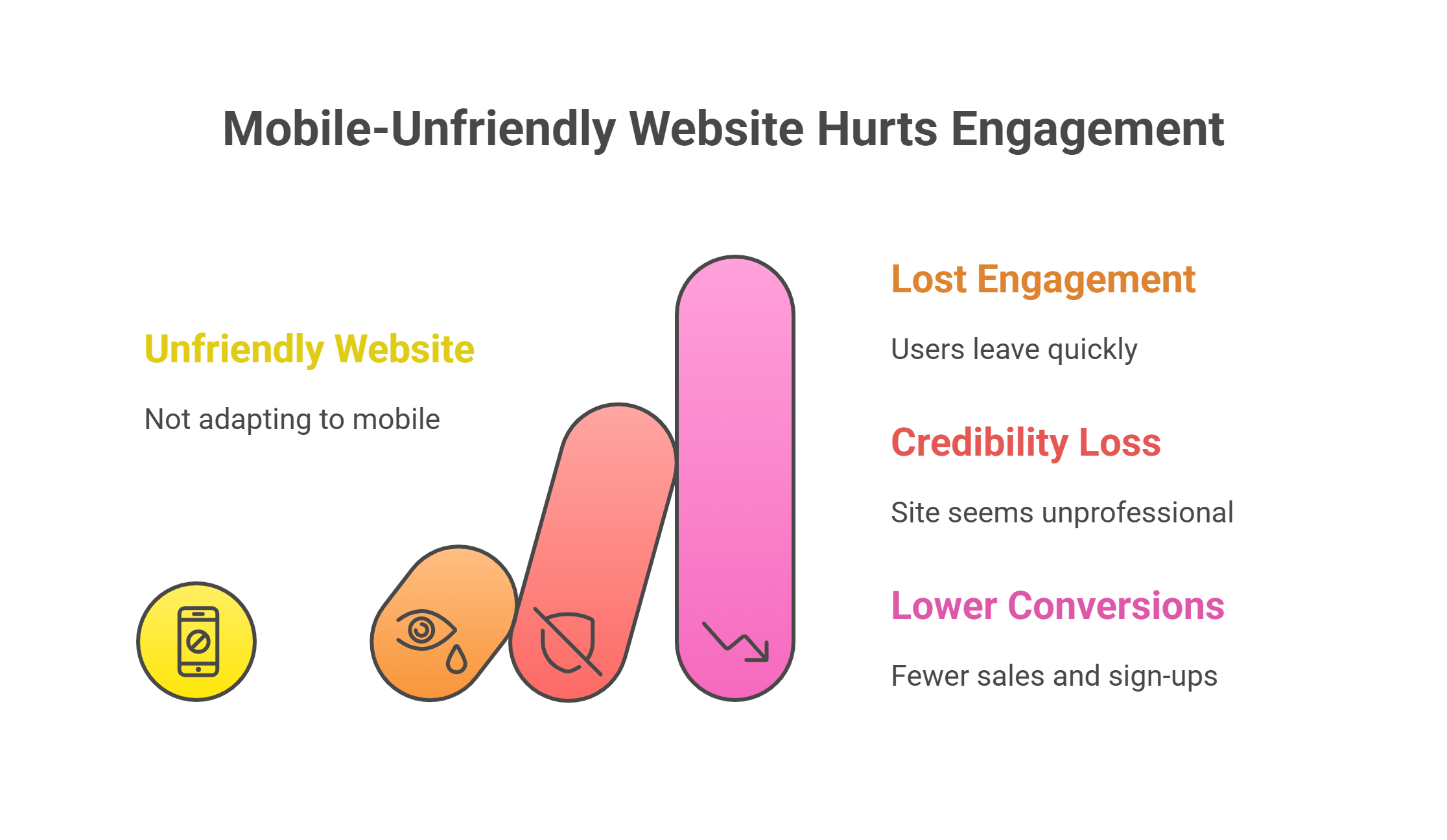
More than half of global web traffic now comes from mobile devices, and that number continues to rise every year. Students checking university portals, parents browsing school admissions, professionals searching for solutions, and customers shopping online—most of them are doing it from their phones. If your site isn’t designed to adapt seamlessly to smaller screens, you risk losing engagement, credibility, and conversions.
A mobile-friendly website is no longer a luxury. It’s the standard.
The Business Impact of Mobile-Friendly Design
1. User Experience Comes First
When a user lands on your site from their phone, they expect it to load quickly, fit their screen, and be easy to navigate. A clunky desktop-only layout, zooming in to read text, or struggling with unclickable buttons can frustrate visitors within seconds. The result? They leave.
A responsive design ensures that no matter the device—smartphone, tablet, or desktop—the user journey is smooth and intuitive. And when users enjoy the experience, they’re more likely to stay, explore, and convert.
2. Higher Conversions and Lower Bounce Rates
Research consistently shows that people are far less likely to engage with a site that isn’t optimized for mobile. Whether it’s submitting a form, signing up for a program, or making a purchase, mobile optimization directly influences conversion rates.
In fact, a one-second delay in page load time on mobile can reduce conversions by up to 20%. That’s not just lost clicks—it’s lost revenue, lost applications, and lost trust.
SEO and Search Visibility: Google’s Mobile-First Indexing
Google has made it crystal clear: mobile performance matters. With mobile-first indexing, Google predominantly uses the mobile version of your website to determine search rankings.
This means if your site doesn’t perform well on mobile, it won’t just impact user experience—it will also push you lower in search results. Lower rankings mean less visibility, and less visibility means fewer opportunities for engagement.
At Intrazero, we design with SEO in mind. Every website we create is built to meet search engine requirements, ensuring not only a beautiful design but also one that works hard behind the scenes to get found.
Accessibility and Trust: Meeting Modern Expectations
A mobile-friendly website also sends a message: we care about our users. It shows that your organization values accessibility, inclusivity, and modern standards.
For educational institutions, this might mean ensuring students can check schedules and results on-the-go. For enterprises, it could mean empowering clients to access portals or reports without technical obstacles. And for startups, a sleek mobile presence builds the credibility needed to compete with larger players.
In every case, a mobile-first design fosters trust and confidence in your brand.
Intrazero’s Approach to Website Development
At Intrazero, we believe a website should be more than just visually appealing—it should perform.
Here’s how we do it:
- Responsive Design from Day One – We build for all screens, ensuring consistency across devices.
- SEO-Friendly Foundations – Optimized structures that align with Google’s mobile-first indexing.
- Performance Optimization – Fast-loading pages that keep users engaged.
- Security & Reliability – Building trust with secure, stable environments.
- Ecosystem Integration – Connecting your website seamlessly with portals, custom software, and mobile applications for a unified digital presence.
Whether it’s a university site, a corporate landing page, or an e-commerce platform, we tailor every solution to meet the real-world needs of our clients and their audiences.
Real-World Examples: Mobile-First in Action
- Higher Education: A university redesigned its student portal for mobile. Students could instantly access timetables, submit forms, and view grades from their phones. Engagement and satisfaction skyrocketed.
- Retail & Services: An e-commerce brand shifted from a desktop-heavy site to a responsive mobile-first platform. Result: conversion rates doubled, and bounce rates dropped significantly.
- Healthcare: A clinic website optimized for mobile allowed patients to easily book appointments, resulting in smoother operations and improved customer trust.
These examples prove that mobile-friendly design isn’t just a technical detail—it’s a business growth driver.
Conclusion: Don’t Get Left Behind
Your website is your digital front door. And today, that door is being opened on mobile screens first.
A mobile-friendly website ensures your business, institution, or startup is ready to engage users wherever they are. Without it, you’re not only losing potential clients—you’re also sending the wrong message about your ability to keep up with today’s digital expectations.
At Intrazero, we craft mobile-first, SEO-ready, and performance-driven websites that go beyond design. We create digital experiences that convert, engage, and build trust.
Is your website ready for the mobile-first world? Let’s build it together.
👉 [Book a free consultation with Intrazero today.]